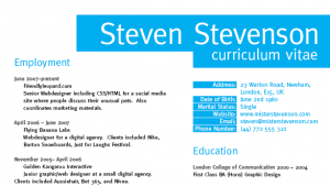
Use the power of grid based designs to create a structured and professional page layout in InDesign, which can then be populated with a range of information to produce a polished CV or Resume.
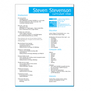
My approach was to create a minimal two colour design that showcased Mr. Stevenson’s sophisticated Graphic Design skills through a clean and structured layout.
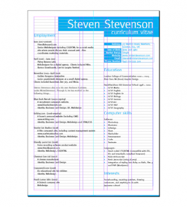
Let’s go process of creating the document, and see how the initial grid layout was produced. Hopefully these techniques will not only help put together your own Resume/CV design, but also span across other Graphic and Website design projects.
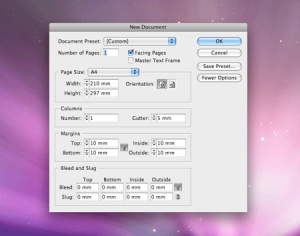
Being a design aimed more towards print, and one that concentrates on the fine grid details, we’ll use Adobe InDesign as the application of choice. Being a desktop publishing package InDesign has a bunch of useful tools for creating complex layouts. Create a new document, set the page size to A4 and place margins at 10mm from each edge. We’re not planning on mass-producing the document so no bleed is necessary, but it could be handy if you’re planning on trimming down the final page if doubled up on an A3 printer.
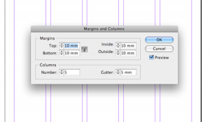
With the basic document set up, go to Layout > Margins and Columns. Create five columns with a gutter of 5mm.
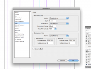
Go to the InDesign preferences and look under the Grids section. With the planned design using a lot of Cyan, it would be handy to change the colour of the gridlines from blue. Choose a colour such as Light Gray. Also change the start to 0mm from the Top Margin, Increment them to every 13pt and untick the Grids in Back option.
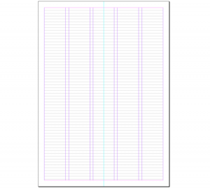
Ensure all grids are visible through the View > Grids and Guides menu. Our page is now ready to place elements accurately in relation to the structured gridlines.
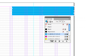
Use the Rectangle Frame Tool to draw a box in the top right corner, with the option to Snap to Grid active the shape should fit exactly to the gridlines. Fill the box with 100% Cyan.
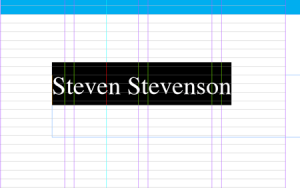
Create a text area with the Type tool and spell out your name. Here we’re using the fictional Steven Stevenson character along with all of his details.
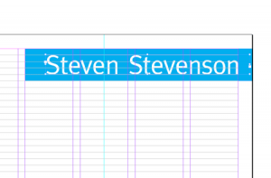
Change the font to a stylish classic, such as Meta. Adjust the size of the type so that the text fits perfectly between the baselines. Once the type is positioned correctly, go to Object > Fitting > Fit Frame to Content. With the title being large in size, any slight inaccuracies will be much more visible, spend a few moments to kern the letters. Place the cursor between two letters and nudge using the Alt and Arrow keys.
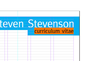
Repeat the process with the second line of text, but this time make the type smaller in size. The key is to ensure the elements align accurately to the nearest gridlines.
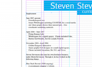
Draw a large text area spanning the first three columns of the page. Paste in a large selection of textual content.
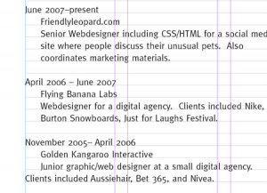
Edit the text by setting in the appropriate font, set the size to 10pt and leading to 13pt to match the baseline grid. Indent the text to provide easy scanning and clear sections for each area of information.
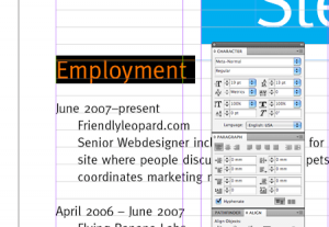
Alter the titles in size and add the Cyan fill. Using variations in size and colour gives prominence to these elements, and helps display the various sections of information clearly.
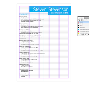
Also alter the sub-headings to develop a clear hierarchy. The main titles at the top of the page stand out the most with their size and vibrant background colour. The secondary information is displayed under medium sized titles, which are also displayed in blue. The next level of information is set is a stronger weight font, but is toned back slightly with an 80% black, and finally the body text uses the standard 10pt black styling.
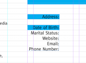
List out the contact details at the top of the right hand column. Draw a blue rectangle behind the text, but shorten it in size to just under the height of the baseline. When duplicated this will leave a tiny dividing line between each item.
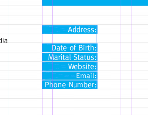
Change the colour of the text to white and align it to the center of the rectangles, as opposed to the baseline itself. Notice how these elements flow neatly from the same gridline as the title.
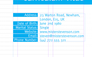
Enter the remaining details and align as appropriate.
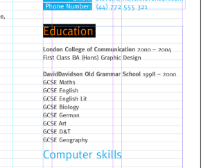
Add the remaining information to a text area spanning the remaining two columns. Use the same text styling and visual hierarchy on the titles and sub-headings.
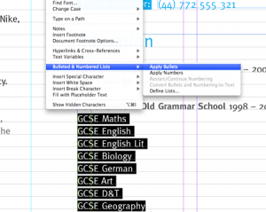
Select the bunch of list items and go to Type > Bulleted & Numbered Lists > Apply Bullets. This will automatically indent the text and add points to each line.
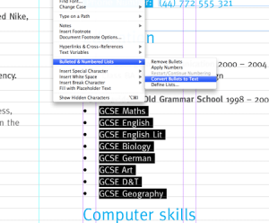
With the list still selected, go to Type > Bulleted & Numbered Lists > Convert Bullets to Text.
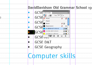
We can now go through and select each bullet point, and change the text colour to Cyan, adding a little visual tweak to the page design.
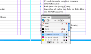
Finish off the bottom of the page with a neat border using a rectangle at 210x2mm. Fill the shape with Cyan.

Zoom out and review the layout. Make any final checks to the page elements and ensure all items are aligned to the underlying grid.

When viewed without the guides the design holds itself together well with neatly aligned content and a clean, structured appearance. Go to File > Print, or export the layout as a PDF document.


